Friday 5 February 2016

Evaluation task 1 - In what ways does your media product use, develop or challenge forms and conventions of real media products?

The music video as a genre of film making has a very limited form. The conventions associated with it are often in place to add, excitement and creativity to what is simply a marketing device. There are an abundance of different conventions for each different genre of music, for example Female Pop videos often use bright colours, exciting visuals, and voyeurism to engage their viewer and reflect a fun, good looking idealist persona. This links into the richard dyer theories of star image. A record label chooses to present their artist in any way they choose in order to appeal to their audience. The conventions are often a proved formula to ensure their artist will be liked, and enjoyed.

My media Products all used, developed and challenged existing forms and conventions of the indie folk genre as well as general conventions of the music video form. By doing this we were able to create a campaign that would be interesting to our target audience.


Simplistic Set design/ low key lighting

A typical convention of the indie folk genre is to have a simplistic set design with low key lighting. This video by Ben Howard shows him and some accompanying musicians playing with the lights only illuminating him and his instruments. This reveals the artist as a performing musician not a commercial artist. As an audience we believe that he cares about his music and according to Richard dyers theory he would be considered an organic artist. The lighting suggests a reflective mood; the singer appears to be thinking internally and expressing the thought within his head. We see him in his own world - represented purely as an artist who cares about his artform.


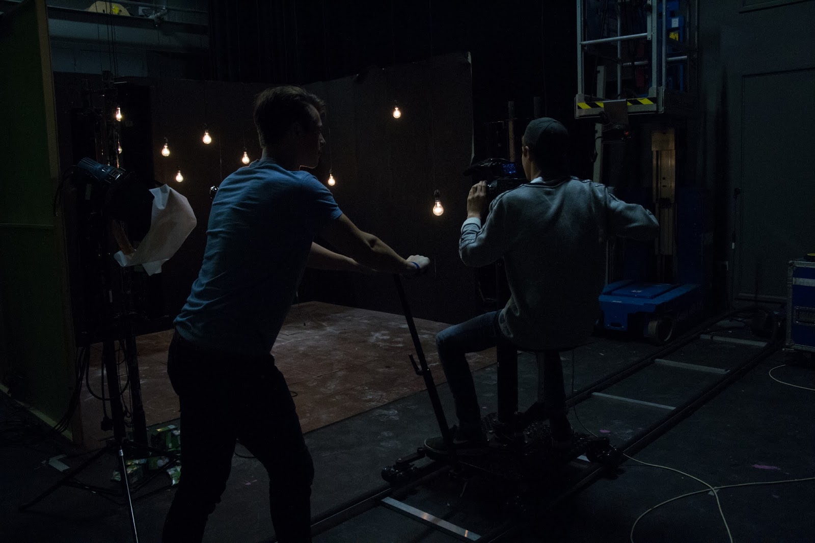
My music video also embraced a simplistic set design, with low key lighting. Inspired by the conventions seen in videos such as 'The fear' we created a set where the background can not be seen due to the low key lighting. Our set consisted of hanging lightbulbs which change in brightness throughout. The simplistic set fits in with the indie/folk genre, and reveals an artist who's career is led by her music, and not by her 'star image'.


Tracking shots

Due to the limited form of music videos, filming using simplistic static shots is often very dull to watch. A music video needs to have a sense of creativity, excitement, and visual appeal if it is to retain a viewers attention for 3 minutes. After watching James Arthur's music video for 'Recovery' we realised how the tracking shot adds a sense of visual appeal to a long shot off the artists singing. we were keen to replicate this convention, making the shots of our singer and drummer more interesting to watch.

James Arthur | Recovery
We effectively used a tracking shot, not only to make the video more visually appealing but also to support the flow off the song. At the start, a slow track is appropriate because the song starts slow, however at epic moments such as the first drum hit, the out track adds drama making the artist look powerful, cool and talented. Te limited form is also the reason we added powder to the drums. It is another layer of visual interest for an audience to keep them entertained, using unnatural visual effects.

Youth | Tracking shot


Close up on key line of song

A close up on the main line of the song is almost always requested by a record label when filming a performance shoot, or a lip sync. They want to establish a connection between the artist and the audience, by ensuring they remember the key line with a repeated motif, or similar shot of the artist. This music video by 'Adele' for the song 'Hello', along with many others, features this convention. As you can see they have used a close up meaning the focus is fully on the artist at this moment, she is styled very well, with soft complementary lighting, and glancing down the lens. All of this combined builds her 'star image', and makes her connect with her audience.


Youth | Main line of song
This is an area in which we chose to challenge the convention as it is often featured in most commercial/ synthetic music promotional videos. Our Music video focused on a metaphorical amplified narrative, and we intended this as our main focus for our viewers. On the main line "the lovers that went wrong" we decided to show the two dancers. They provide new perspectives on the song, and bring out the meaning of the words rather than the artists image. This in fact reveals to an audience how the artists are caring about art, creation and their music rather than a synthetic image.

We didn't however ignore the convention of a close up on the artist at other points in the song.
A close up on the singer with direct address is a very common convention. Like adele does we made the creative decision to shoot a CU of our lead singer using direct address in order to strengthen the relationship between artist and audience. Furthermore, we creatively chose to shoot these sections using an 80mm prime lens which gives a faithful, flattering perspective of the artists face, with a soft depth of field. Overall this shot builds recognition for the artist and her beauty, whilst simultaneously revealing her as a meaningful songwriter, and creator of art.

Youth | Close up


Dance

According to Andrew Goodwins theory of amplification in music videos, suggests that the images amplify the lyrics often in an exaggerated manor through a narrative. During the research and planning stage we encountered a wide range of music videos that support this theory. A clear way in which this is often done in music videos is through dance. Sia uses dance in her video 'chandelier' features a young girl, frantically dancing her way through various rooms of a seriously dilapidated apartment. The contemporary movement gives the video a manic qualiy, that reflects the theme and pace of the song. It also gives a new perspective, looking at the lyrics through the metaphorical dance allows us to interpret the song in different ways.

Sia | Chandelier

We Knew from the start that we wanted to replicate this convention, as we had 2 ideal dancers to play the parts. The dance we collaboratively choreographed was suiting to the pace and storyline of the song. We ensured that this amplification of the lyrics, added new meanings and references. The love story between the two dancers is illustrative of the lyric "The lovers that went wrong", the key line, thus why we chose to focus on the dance during this line; because it focused our viewers on the narrative rather than the band image. This also constructs a representation of our artist that tells an audience they are interested more in art, creativity and talent than constructing a commercial image for themselves. This is conventional of the indie/folk genre.


Indy Album Covers

Before creating the album cover, we did some research into the conventional album covers for indy/folk artists. We noticed from bands such as Ben Howard and the Head and the Heart that the images usually alluded to peace, freedom, and beauty. The artists would not feature themselves at the forefront  of the album cover, because they didn't want the focus on themselves they wanted the image to be a reflection of the sound they create in their music. For example in this image by The Head and the Heart they are shown to be lying on the ground in an empty space. This gives a carefree look, and suggests their music has a relaxing sound and vibe. The use of grain, low contrast and earthy colours is very typical of the genre.
The Head and the Heart

We intended to replicate this convention in our Album cover. we placed our artists facing away from the camera looking out into the distance from a picturesque viewpoint. The rural scenery was inspired from the conventions of indy folk album covers. We added a grain and a bright purple colour scheme. This colour was used to make the image more stylised and significant. 

My Digipak

Minimalist Website Layout

Before making the website we took design inspiration from other indy/folk artists' websites. We immediately noticed the repeated convention of simplicity accross all of the websites. Most notably was Ben howards. He utalised a very minimalist style. You are greeted with one of his latest music videos straight away, it is very alternative, The colours are faded to reflect his indie style. Ben Howard is following the Star Theory of letting fans know what he’s about, so the website showing his old school simplistic style, however he is still holding back who he really is leaving a mystery about him. Ben Howard does not feature on the website at all (other than during the four seconds at the beginning), therefore enforcing the mysterious element that he is clearly trying to portray. This following Richard Dyers star theory.


we supported these conventions of minimalism and reveal an interest in the music not the image. 

Thursday 7 January 2016

Tuesday 5 January 2016

Friday 18 December 2015

Focus group write up

A focus group, is a productive response process where a group of people are assembled to participate in a discussion about a product before it is launched. We arranged a focus group in order to asses the quality and impression our products make on an audience, and the way they fit together as a campaign. In preparation for this discussion, as a group we quickly ensured all products were in a presentable form. The Final cut of the video was presentable from youtube, The website was published and the link was ready on an email. In order to allow a more realistic hands on view of our digipak we printed it out and stuck it to card board in the shape of a legitimate album. This was useful for the audience so they could see it in its correct form rather than a series of images and text in the wrong arrangement.

At the focus group we prepared open ended and flexible questions focussing only on our products. For example what kind of band do you think they are? What do you think of the music video?  What do think about the website?. Unfortunately Max and I were unable to attend the focus group and therefore Ksenia lead the session and recorded all the responses and feedback. Using a voice recorder was a clear choice as the discreetness doesn't concern an audience and encourage them to think to much about what they say about our products, therefore we received a more reliable response.

They discussed all three products, raising some issues that we had noted and knew we were going to work on. The key point made was about the coherence of our campaign as a whole. they felt the digipak, seemed too distant from the other products. This was due to the rurla setting in comparison to the urban contemporary location of the music video. To correct this they suggested changing the colours of the digipak to give colder less saturated tones. We attempted this, and this was the result:


We felt that in doing this we had made the made image on our digipak less impressive dull and less striking. We felt that in an attempt to please everyone in our audience, the product had become less interesting. We didnt want a bland product therefore we decided to stick to the original purple tones.


In a addition to this feedback they claimed they loved the video, and the emotion it created, and they felt the website was a good webpage to represent the band. They way it cross-promotes other products was effective and they enjoyed the simplistic minimalist style. 

Tuesday 15 December 2015

Friday 11 December 2015

Editing 5 | Colour grading

The colouring process seems like an endless task. There a huge amount of tools that adobe premiere provides to adjust the colours and tones and all of these, at first, appear very complicated to use. However I began simple and then later developed the grade on each clip tweaking it till it was just right. This took around 4 hours in total to complete. Midway through the process, I captured a screen recording, Here is a time lapse to show how I coloured the video.


From watching this it is clear to see how many shots are out of place and have the wrong colours. I continued to tweak the footage till each shot looked precisely how i wanted. This involved going into great depth with the colouring. Here is a breakdown of the process.

I began by doing some colour correction. This is the process where every clip is manually tweaked to get a good exposure and balance of light. Each clip was also matched to a colour temperate which I set as a cold blueish colour. Using the built in scopes on premiere I was able to visually inspect the Waveform, vectroscope and parade levels to match each shot precisely making sure no exposures were blown out, no darks were lost and the shots looked natural. Here is a screenshot of the scopes. Although it looks complicated, knowing how to read these can make the corrections much more precise.

I then moved onto doing some colour grading this is the creative process where decisions are made to further enhance or establish a new visual tone to the project I chose a cold high contrast grade, to emulate the urban tone. Here is a before and after.


As I progressed through the grade, copy and pasting the same adjustments onto every clip doesn't mean they match up. Almost always the lighting was different. Therefore I had to match the colours on every clip. I did this through using a layer mask. This means i could select the skin tone colours and adjust only the so they still looked natural under the colour grade.

With final adjustments such as these and ensuring every shot matched. The editing process was complete. The next thing to do is to get some feedback on my video and see what can be improved before I export the video.


Saturday 5 December 2015

Editing 4: Finalised cut

With some Audience feedback, I have taken on board some advice for the cut such as slightly slowing down the pace of the studio cut, and removing some shots that didn't work.


The cut needs no visual effects therefore the only thing left to do is colour the video. This will be a difficult process as i have to bring the two sections to the video closer together visually. I need to using the levels, bringing the brightness closer to a midpoint of each clip. I also plan to put a grade over the entire video that will give it a higher contrast, coloured and more stylised look. This is often what makes most music videos look professional. I will experiment with colours and find something that suits the mood of my video. As I am going for quite an urban look with the dance I may use cold colours, with an increased contrast. 

Thursday 3 December 2015

Editing 3

after about 5 more editing sessions I have now added the dance section and completed some small adjustments to the flow of the video. When adding the dance sequence I firstly chose the best sections of dance to put in the video. I chose 6 sections out of the 10 we filmed. These were the most visually interesting and the best showcase of their dance skills. These sections were fairly evenly distributed throughout the track, giving even amounts of studio and dance footage. When i edited the dance i was concered about Graphic editing. This is where the images in the cut are matched according to similarities in their pictorial qualities (movement of actors, light and colour, shapes of images, etc.). It was clear from some feedback that some cuts matched certain cuts didn't.


For example, This cut works effectively, as the shots are both dark and the movement matches to the beats that have been previously accented by the drums.


However this cut is ineffective as it is a clear change from dark to light. I tried to make it match slightly more by adding a slight moment of slow movement at the start of the dance to match with the pace. However the change in both colour and brightness is too unexpected for an audience.


My solution to this problem can easily be solved in the colour grade, which is my next job wehn the cut is finalised.

Wednesday 2 December 2015

Monday 30 November 2015

Editing 2

After a few more editing sessions I finally have the studio section completed. I had to bare a few things in mind when doing this in order to make the editing of the studio suit the track and not look abnormal. My first priority was rhythmic editing, This is where the editing pace reflects the pace and beat of the track. The song begins slow, therefore I decided to only cut every 3-4 seconds on specific beats of the song. When cutting to the beat of the song the editing often flows better. I sometimes look at cutting to music as a person trying to clap in time to the beat, when cuts are late or in unexpected places it can feel like someone trying to stay in time but they have no rhythm and therefore can't, which is almost frustrating to watch. 

Despite this as the song progressed I made the decision to give the music video a more modern exciting twist. Cutting to the beat is the safe bet, but not always the 'best' bet in terms of telling the story. I began to look at the music as a whole, not just a beat. Where does it peak? Where is lull? What shots would suit those sections best? And as a result I added some cuts that didn't match the beats of the song, that could surprise the viewer and keep them engaged. The issue with this however is that some cuts may seem out of place. I made sure that I watched back the footage over and over with second opinions to see whether the cuts were interesting and not distracting. 

My next job will be to layer the narrative in my chosen places on top of the studio cut, this should be an easier edit as i have cut dance sequences before, and the movement will work in a sequence it is not random.


Friday 27 November 2015

Photoshoot for the Digipack

After Shooting our video we now decided it would be a good time to begin work on our other products. I was in charge of the music video, Ksenia was in charge of the website and Max would lead the production of the digipack however we are all going to collaborate every day or two on the progress of each product. This shoot was an important part of our campaign and the images will be used on both the website and the digipack so we all chose to go as a team. Our location is a viewpoint on the top of the surrey hills, from our research this will provide a great background to place our actors infront of to produce an indie album cover.

We did some research into similar products and here are some of the digipacks that we based our ideas on.


With our research in mind we shot our images, using a variety of different positions and styles. We took as many shots as possible so we had a good choice for the website and digipack. Once collating the photos, we began some post production work, using the photo editing software Adobe Lightroom. This Allowed us to enhance the images bringing them closer to the indie style and look ,which from our research was often a heavily processed image. We increased the clarity and contrast, whilst adding a purple tone over the images. Here are the results:


Thursday 26 November 2015

First editing session

Today was our first editing session since the shoot days. It was very interesting to watch back all the footage we had captured and think of some ideas of how it could be structured. I knew after watching the location footage that a lot of this would have to be cut. The song is only 3 minutes and we ensured that we had enough footage to fill the entire thing almost. It iis much better to get too much footage than not enough. The most obvious issue at first glance was the difference between the two shoots. Despite a meeting with the lighting and set designers the studio shoot still appeared much darker in appearance and this when placed next to the location footage in daylight appeared to be a massive juxtaposition. After watching all the footage I began the most tedious process of editing: syncing the clips. This video shows how I did this. I only synced the studio footage because I knew that I would differentiate the dance to its original timing to make it seem more impressive or fit slightly better. In order to make the syncing process easier and more precise we added 6 loud beats leading into the song. This was not only a cue for the performers but it also using the cameras mic allowed us to use the waveform of the loud beats to match up with the waveform of the song in editing (ofcourse this will be later edited out). 


I repeated this with all of my studio clips, until I had 40 layers on my timeline all with synced footage. After this, I played each one and noted both good shots which I definitely want to use at some point and shots that are useless and will not be used, I then deleted the useless footage. My plan for the next few editing sessions is to shape the studio section and fill the entire video with only studio as a base for me to place my dance section on top.

Tuesday 24 November 2015

Studio Shoot


In preparation for the shoot, we had to ensure we were organised, and therefore could swiftly capture everything we intended. As it was a very simple shoot there was not much to prepare. Our most important concern was our performers. We rehearsed our band once again the day before, which left us feeling confident as they knew the words, the beat and gave a solid performance. I spoke to the lighting designer and set design to ensure the set and lighting would match with the footage we had already filmed. They ensured me that it would be easily matched in the colour grade. We finally went through all of our desired shots. We planned to capture the basic shots first including wides, mediums and close ups, following the creative shots such as tracking. Max agreed to buy some talcum powder for our drum effect, we then had everything planned and were very prepared for the shoot.


Before we began shooting we set up the mic and drums in the positions we wanted for the first shot. I then spoke to the lighting designer to work out some timing with what lightbulbs could turn on when. Whilst I did this Ksenia worked on the makeup of both performers, and ensured they were dressed correctly and looked the part.


Our set was a 3 wall box with the lightbulbs randomly arranged. It was a very simple look, therefore we knew we had to be creative with our shots to make it look more exciting and match the excitement of the dance section. To add ambience to the room, and give the shots a more stylised look I requested to fill the set with a slight mist. This enhanced beams of light and gave the video a mysterious feel.


I mainly worked as the cameraman for the day, however I ensured the actors performed in the way we wanted and decided on what shots to do, therefore I additionally took on a directorial role. Towards the end of the day I worked as a grip to make sure the track was as smooth as it could be.


Personally I feel the creative choices I made on the day will benefit the video. For example, I decided to capture specific moments using an out/in track. This is a powerful and dramatic shot which should prove beneficial to me when cutting the video. I also ensured the lighting was timed to the music. I wanted the lights to flash brighter on each big beat of the song. This was made possible by the lighting designer, and looked effective on the monitor.


We faced very few problems on this shoot. Although overall, we worked fairly slowly and thus were not able to get every shot we intended. I tried to capture as many shots as possible, and continued to repeat shots to ensure it was perfect in terms of camera work and performance. This repetition left little time for the creative shots that we captured at the end of the day. I feel that if we had speed up the changeover in between shooting we would have had more time for creative experimenting with the camera work.


The most succesful part of this shoot was the fact that we had already filmed half of the video. By allowing two shoot days we were granted much more time to work on this section of the music video. We had the time to capture almost all lot of the shots we wanted, and make it look as best as it could.


Rehearsing the talent 4 times before shooting meant they were very prepared for the day, and did not slow down the shoot in any way due to forgetting the words/beat. They performed confidently and matched the track very well almost every time. In order to make sure they did not tire during the shoot whilst they were not being used we kept them entertained by talking to them, asking them for their input, and offering refreshments.


The part of the shoot which I enjoyed the most was filming the drum shots. The talcum powder provided a brilliant effect, and really enhanced the visual look of the film on each beat of the song. I went for some interesting angles on this such and managed to capture my intended outward track. This is also the bit I am most looking forward to seeing in the edit.


My group worked effectively as a team, we each had our own input to the production, which benefited the video in different ways. Max came up with some great ideas for shots and gave very good direction to the actors, whilst Ksenia worked brilliantly on art direction, making our video and the actors in it look as good as possible.

After the shoot I now understand how on future shoots I need to work more swiftly in between shots. This will speed up the process and leave more time for creativity. The more footage captured the better the video is likely to be. 

Tuesday 10 November 2015

Location Shoot


The shoot began at 10:00am where I met josh gracie and the rest of the team to begin discussing our plan for the day. Josh and gracie told us about some interesting urban locations, which suited our ideas very well. 


Josh and Gracie performed a quick rehearsal of the dance, during this we confirmed some key moments where we wanted to use particular shots, for the rest we would simply capture a wide, some mid shots and close ups. Once this was done we headed to the location which we presumed would be most difficult; This was next to the Millenium bridge, on southbank. The main issue we faced here was the people. We had to frequently ask people if they could walk around, in order to avoid having people in the background. We also gathered a large crowd as we were filming, this slowed down our process slightly, however it was not a big issue as the dancers are used to performing infornt of a crowd.


Our second location was the pier. Here we chose to film Josh, solo, for the opening and then the two together for a moment later on in the video. We captured a variety of shots, including some wides with a 25mm lens, the rest was captured on a 50mm 1.4, giving a very shallow depth of field. this caused us slight trouble when trying to stay in focus with the frantic actions. We only shot handheld to support the movement, this was stabilized using a shoulder rig. We started with the wide, the moved to mediums, close ups, then we were able to get creative by shooting specific camera moves and picking out key details in the dance.


We then moved to our final location, which was the most urban looking place. The dance here was most energetic as it will be featured towards the end of the song. I took a directorial role at this point. And ensured the chemistry between the dancers followed our intentions and the mood of the song. I then decided to shoot a quick narritive sequence we had planned, where the dancers run behnd a wall, go in for a kiss then the boy throws the girls face away. This establishes the breakdown of the relationship. We found a brilliant set of stairs to shoot this on. And with a few takes of this, this shoot was finished.

I believe we captured everything we intended, plus a few extra creative shots we hadn't planned. It was a successful shoot with very few problems, and the ones we did come across, we managed to overcome very quickly.